Help Me Read Your Website

A guide to helping your visitors to read the important bits on your webpage.
There’s no easy way to say this so I’m just going to come out with it…. Your visitors don’t even bother to read the text on your webpage…….
they just about manage to scan it.
They scan over all your carefully thought out text skipping huge chunks of vital information because they have far more important things to be doing and unless something jumps out and grabs them by the eyeballs they’re closing this tab and jumping onto facebook to see how Fiacra is getting on in Finland.
We all do it, our behaviour when reading a webpage is different to printed material, our attention span is reduced and we are always searching for the bit that is relevant to us.
So how do we at least get them to read the important bits?
First we analyse the problem. How do we know they scan?
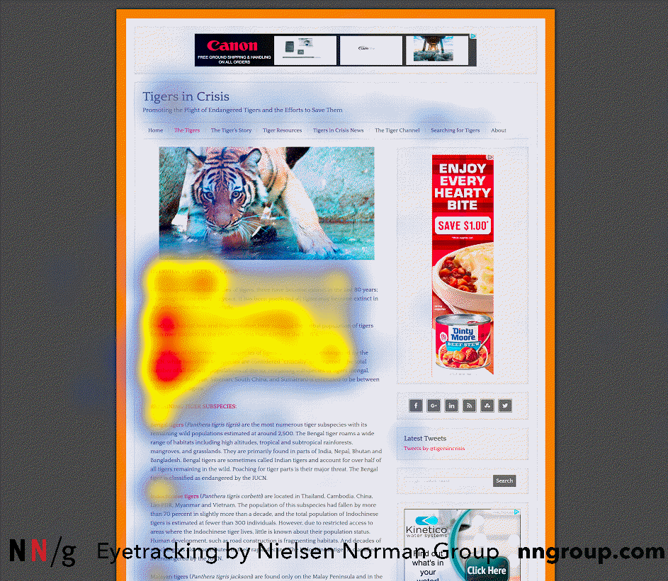
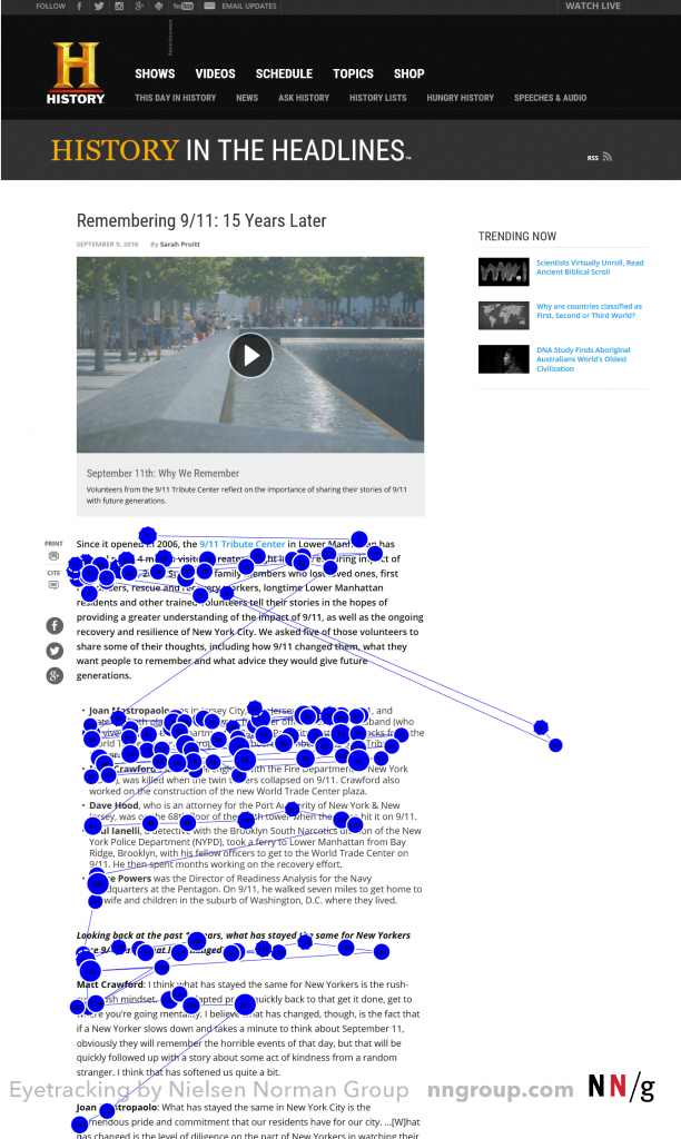
Thankfully some clever people have already done all the hard work for us. If we look at the revised F shaped pattern study 2017 by Nielsen Norman Group we can see a common behaviour pattern of people scanning a webpage. This is the same pattern that existed in the original study 11 years prior.

Nielsen Norman Group
The F-pattern is the default pattern when there are no strong cues to attract the eyes towards meaningful information. This means users can easily miss the info we really want them to see. This isn’t the only scanning pattern but is very prevalent when no clever formatting has been applied.
We can’t manipulate this pattern to suit us (like sticking the important words in the path of the pattern) as when the text responds to a different screen size the layout of our text will change. The important sentence on line 3 when browsing on my laptop has now moved to line 5 when I have a look on my tablet.
This F-Shaped pattern happens when these 3 things exist:
1 A web page or a section of the page includes text that has has not been well formatted well for web. For example, it has a “wall of text” but no bolding, bullets, or subheadings.
2 The user is trying to be most efficient on that page.
3 The user is not so committed or interested that he is willing to read every word.
Source: Nielsen Norman Group

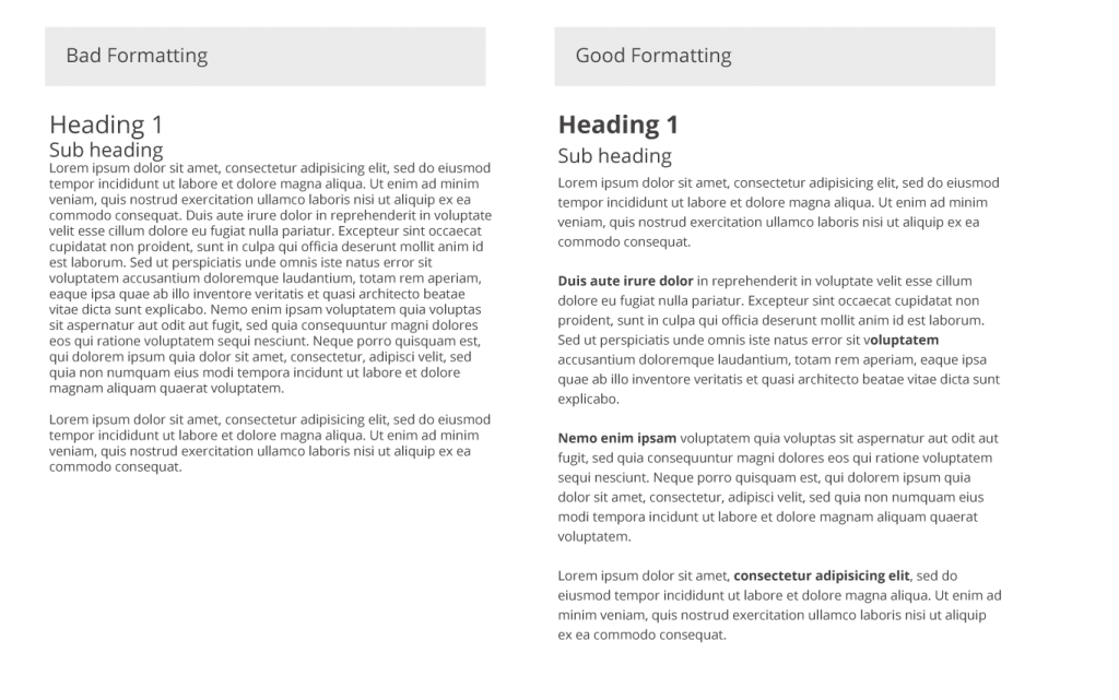
What can I do to improve my text layout and avoid the F-Shaped pattern.
Point 1 you can actually do something about. Points 2 & 3 are harder or impossible to control so lets focus on point 1 and look at some clever formatting techniques.
Clever Formatting Techniques
Include the most important points in the first two paragraphs on the page.
Don’t save the best for last dish it out straight away. A webpage is not a book.
Use headings and subheadings.
Ensure they look more important, and are more visible, than normal text so users may distinguish them quickly.
This breaks up the page. The reader can categorise the info quickly.
Start headings and subheadings with the words carrying most information:
If users see only the first 2 words, they should still get the gist of the following section.
Visually group small amounts of related content.
Try using a different background colour or border. This helps the brain understand the info is related and separate to the surrounding content.
Bold important words and phrases.
This gives the reader a feel for the content at a glance. When reading a paragraph the introduction of some key phrases in bold breaks up the text and keeps the reader intrigued to read on.
Take advantage of the different formatting of links
Ensure that links include information-bearing words (instead of generic “go”, “click here” or “more”). This technique also improves accessibility for users who hear links read aloud and will help improve your SEO
Use bullets and numbers to call out items in a list or process.
Our brains can then instantly jump into list mode and again it breaks up the layout of the page.
Cut unnecessary content.
Cut the fluff and filler text. Adding in text just to fill out a page will result in none of the text being read. Remember, an image can say a thousand words!

No more ‘F’ing pattern
Find a bit of text on your site that could do with a lift (the terms & conditions page is usually a good place to start) and apply the above. You will see that every word has more purpose and the page as a whole is more aesthetically pleasing.
You have now avoided the F-Shaped pattern and made the internet a more user friendly place.
If you want any further advise or a quick review of your site please contact us at dmac media.


 A Retailers guide to Organic Social Posting
 Learning From The Best- Amplify Digital Marketing Conference
 How to Talk to Technical Support