Choosing the Right Imagery for your Website

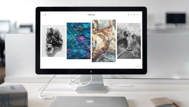
Nearly every day I find myself browsing stock imagery sites, putting together a selection of stock images for clients to choose from. Having great imagery is a must but finding the right images for your website can be quite a challenge so here’s a few pointers in the right direction.
What job do you want an image to do?
Are you using the image as
- A visual guide
- A visual instruction
- or to set the mood.
A Visual Guide.
 Take for example a plumber’s website. With another freezing Irish winter drawing close the plumber knows there will be a surge in burst pipes. When visitors land on his homepage he wants them to notice his pipe replacement service immediately. Instead of simply having the words ‘Burst pipes? click here’ he uses an image of a pipe spraying out water and his customers don’t waste anytime in getting where they want.
No matter what your product or service, depicting it through imagery makes it very easy for your customers even if they don’t speak the same language!
Visual Instructions.
Take for example the call to action ‘Click here for a quote’, placed well on your website simple text may do the job especially supported with an icon but imagery can really get people clicking. Picture an employee pointing to the quote button. Your call to action gains some life, personality and gets your website working for you.
Setting the mood.
 A strong image on your homepage can really set the mood to a new visitor and sum up what you’re all about. This type of imagery is usually quite generic. Take for example an outdoor adventure centre. A strong image of mountainous terrain with a lake in the foreground immediately gives that great outdoors feeling and makes you want to shutdown the computer and head on out there.
Where to source quality imagery?
In House Imagery
In house photography is actually the most effective method WHEN DONE RIGHT. It gives a real personal touch. It’s original so potential customers associate with your business and remember it . However there is nothing worse on a webpage than poor quality photos with a bad composition. It can be well worth your time and money to get a photographer in for the day and you can always use the photos for all areas of your business.
Stock imagery
By far the most popular approach for a few reasons. They don’t cost much, you can get professional images from twelve euro each on istock.com. They don’t take much effort, a few clicks and its done and they can add a real professional look to your site.
There is a fine balance though. The overuse of stock images can make your site look churned out and images that don’t quite fit in stick out like a sore thumb. Put some thought into your choices and how you use them.
Be kind to your visitors, communicate with some strong imagery and avoid pages of text.
If you need guidance in choosing the right imagery for your project don’t hesitate to get in touch as we would be happy to have a quick chat and steer you in the right direction.


 Simple Navigation - the key to a happy visitor
 What is a Content Management System (CMS)
 Some SEO Questions Answered